Brand creation and new assets for Developer++.
The directors of Developer++ decided it was time to have a brand refresh and once again DL Design was called in to help.
Let’s have a look at the creative process in more detail.
The brief.
Developer++ was looking for a brand refresh to reflect its core values, mission and tone of voice and wanted the brand to be launched in time to market its workshops planned for later in the year.
The mission.
To make a positive impact on people by enabling everyone to become behaviour transformationalists.
The values.
The four core values to represent were; Honesty, Transparency, Fun and Positivity.
The tone of voice.
To use real language which is soft and gentle, passionate and energetic, and of course positive.
Target audiences.
There were four; Corporate, HR, Technical and Entrepreneur.
Design requirements and deliverables.
Developer++ was looking for four areas to be refreshed; Design, Colour, Typography and Imagery. Three different design styles were requested; Safe, Slightly out there and Pushing the boundaries.
We started with the logo design concepts.
After reading through and absorbing the client’s requirements, DL Design started designing concepts for the logo. Below you can see stage 1 showing a ‘Safe’, ‘Slightly out there’ and ‘Pushing the boundaries’ design. The overriding theme seemed to be that Developer++ were an approachable company and by working with them you would feel positive, this is where the idea for the character with its arms outstretched came from.
Stage 1 designs.
The chosen style was one of the ‘pushing the boundaries’ logos. Design tweaks were requested and stage 2 designs were presented which can be seen below.
Stage 2 designs.
Minor tweaks were requested to the weight of the plus signs and stage 3 designs were presented which can be seen below.
Stage 3 designs.
Once these tweaks were made, the final logo was chosen.
Here’s what happened next.
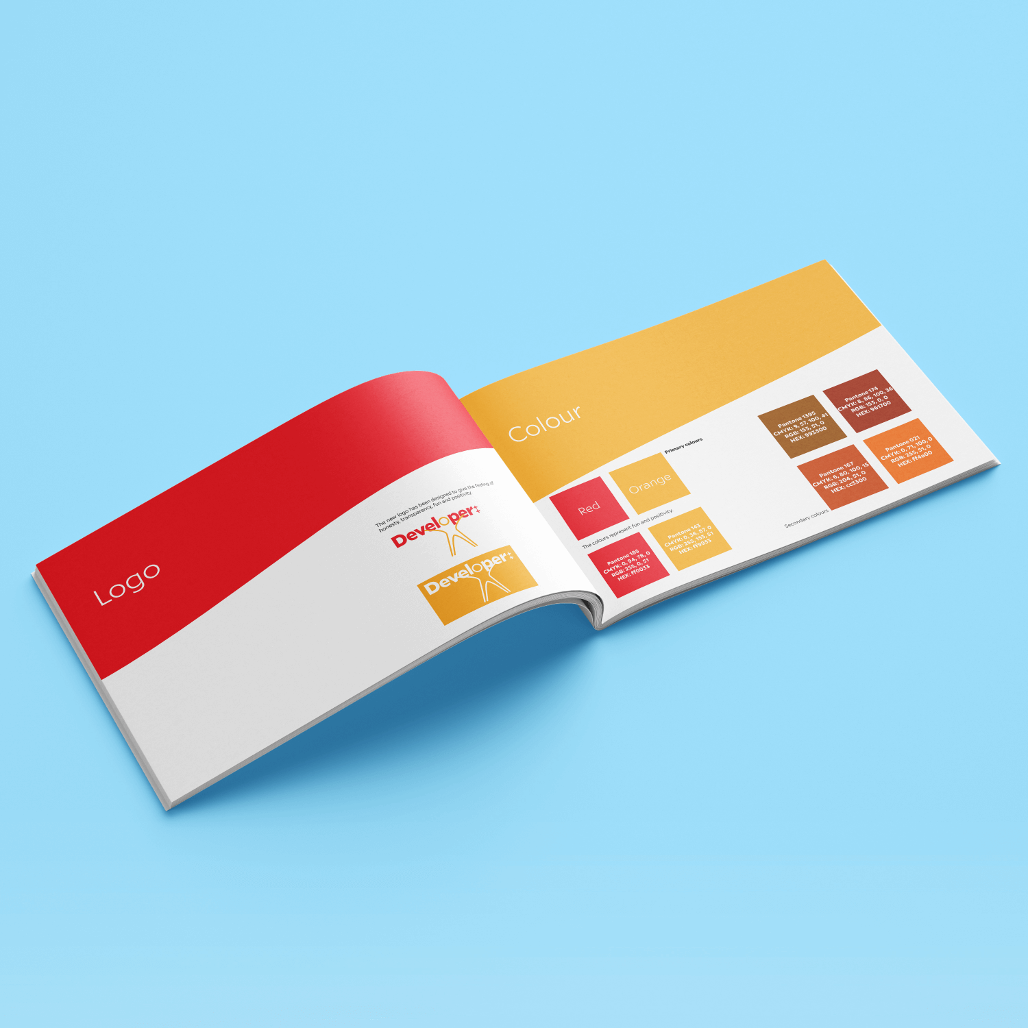
A set of brand guidelines was designed to show colours complete with their colour breakdown values for print and web. Fonts and their suggested weights were also specified, as was the suggested imagery.
To complete the project, business cards, notepads and a Facebook header were also designed to reflect the brand’s online presence.
A complete set of logo files was created, this way Developer++ could use them in print or on the web, while still keeping true to their brand. The new brand is now live and bookings are being taken for the up-and-coming workshops.
Here’s what Sean had to say about the project.
“Using Darren Guiheen to create a new brand for our business was effortless on our part. His communication and speed of delivery given our tight deadlines were outstanding! I would recommend 100%.”


